
Personalize Your Space
Organizing is the ultimate personalization of your space. Its putting things in their place based on what you use and how you use it. It also means your space will better reflect you. So, how do you begin to personalize your space? Most importantly, spend time in the space and consider what works and what doesn't, what you like to look at and what you don't. Even if it's a mirror in your bathroom. Simple swaps leave you feeling refreshed and better represented. What does your home say about you? What do you want it to say? Do you want to walk in to one room and feel calm and another room and feel energized? Paint, furniture, and decor can help you achieve this. Be selective in what you display and know why you've chosen to display it.
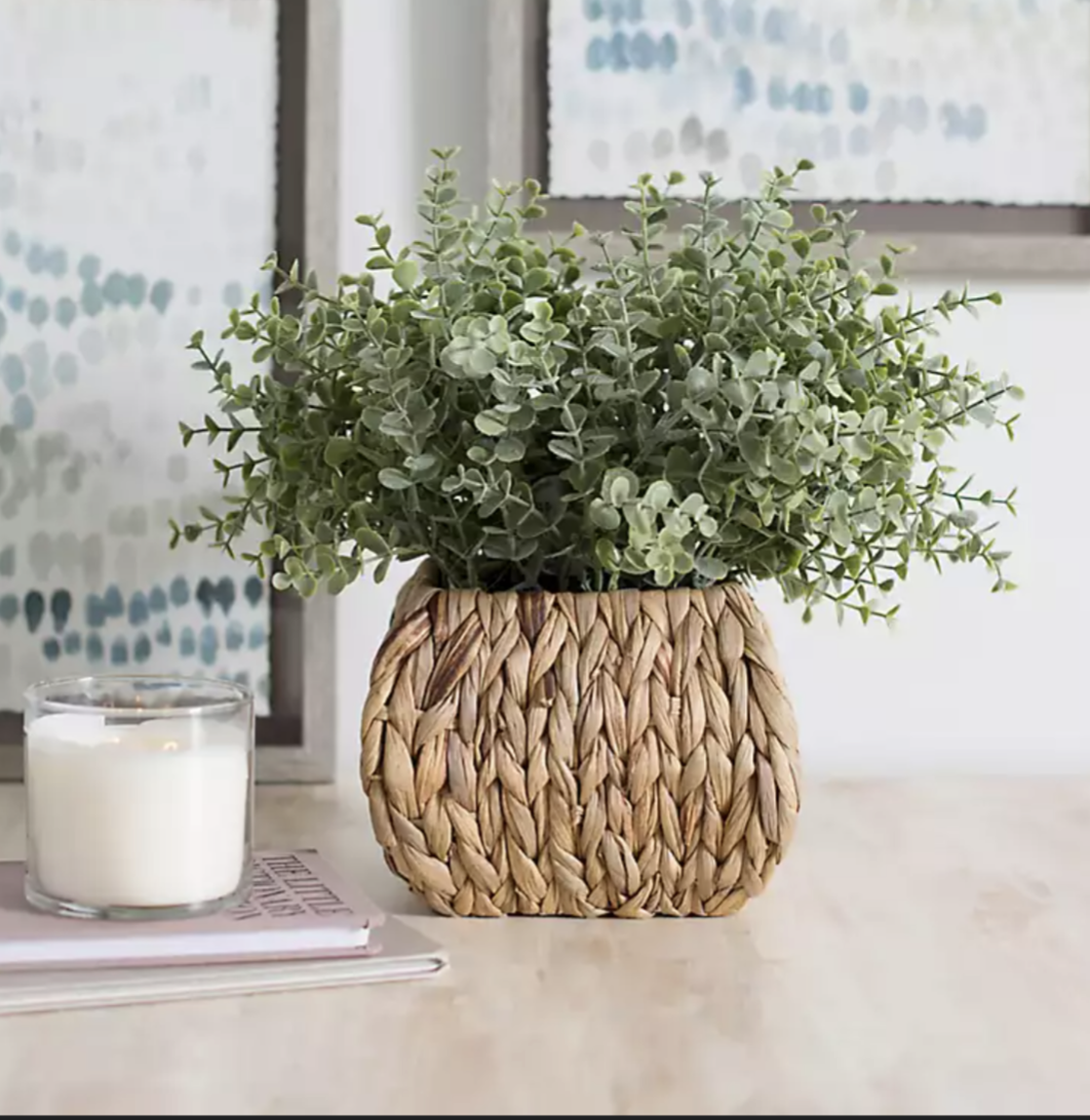
Even changing the height of a shelf is personalizing a space. It's making items easier or harder to access based on how you use them. If something is frustrating because it's out of reach or you don't use things because they're hard to access, consider personalizing to your needs. Change a shelf, add a shelf, create new spaces for items with furniture. If you don't like the way something looks, consider finding furniture with drawers or cabinet doors. You can even find a cute basket to hide things in. Whatever it is, spend time making sure that each space in your house makes you happy and reflects you. If you don't know where to start, think about a space that you don't like to spend time around. What would make it better? Even consider colors that make you happy or little things like fresh flowers. You can do anything!

How to Choose Color
How to choose colors in design, paint, and décor based on psychology
Choosing a décor color for can be stressful. There are so many options, so many hues, so many mixes to match. But when we understand what color does and what space we are putting it in, it helps the decision-making process. Color has more power than we often realize, it influences the way we feel, how we perceive time, how we respond, even our appetite. We can walk in to a room and feel instantaneously at ease or suddenly agitated and overwhelmed. This can be attributed, largely, to color. A room can be neatly organized but still instigate anxiety just because it is painted in an agitating or overstimulating hue. So, ask yourself what would you like to feel when you enter a room and let’s get started!
Red - appetite, passion, determination
stimulates urgency, caution
intense
Pink - youth, caring, emotion
stimulates energy, action
friendly
Orange - enthusiasm, optimism, adventure
stimulates freedom, curiosity
excited
Yellow - communication, joy, attention
stimulates awareness, energy
joyous
Green - health, nature, peace
stimulates encouragement, growth
refreshed
Blue - calm, trust, productivity
stimulates productivity, order
calm
Purple - creativity, wisdom, royalty
stimulates intuition, inspiration
powerful
Brown - dependable, organic, stable
stimulates reliability, authenticity
stable
Black - authority, power, mystery, elegance
stimulates authority, intimidation
confident
White - simple, luxury, security
stimulates openness, timelessness
composed
Grey - conservative, practical, formal
stimulates composure, maturation
balanced
Now that you’ve chosen your color, you can tone it down by opting for a more pastel version or amp it up by going for a more pure version of that color. Cool undertones lean more towards blue/green so keep in mind what the color blue evokes and warm undertones lean more towards red/yellow so keep in mind what the color red evokes. So, if you want to calm your color down, choose a cool undertone and if you want to wake a color up, choose a warm undertone.